Teck Digital Analytics Design System
A design system is a comprehensive toolkit for creating visually appealing and functional products. It includes rules, logic, Figma components, code, guidelines, and other tools that designers and developers use to ensure consistency and cohesion.
Intro
Teck's Digital Department, founded in 2018, faced repetitive design work due to the lack of a standard across teams.
In early 2023, the Design System project launched, now streamlining 5 major products across 3 design teams and 14 designers, enhancing consistency and efficiency.
Team & Responsibilities
UX Manager: Roadmap, feedback
2 UX Designers:
Contribute to the Foundations and Components files
Provide support for other designers
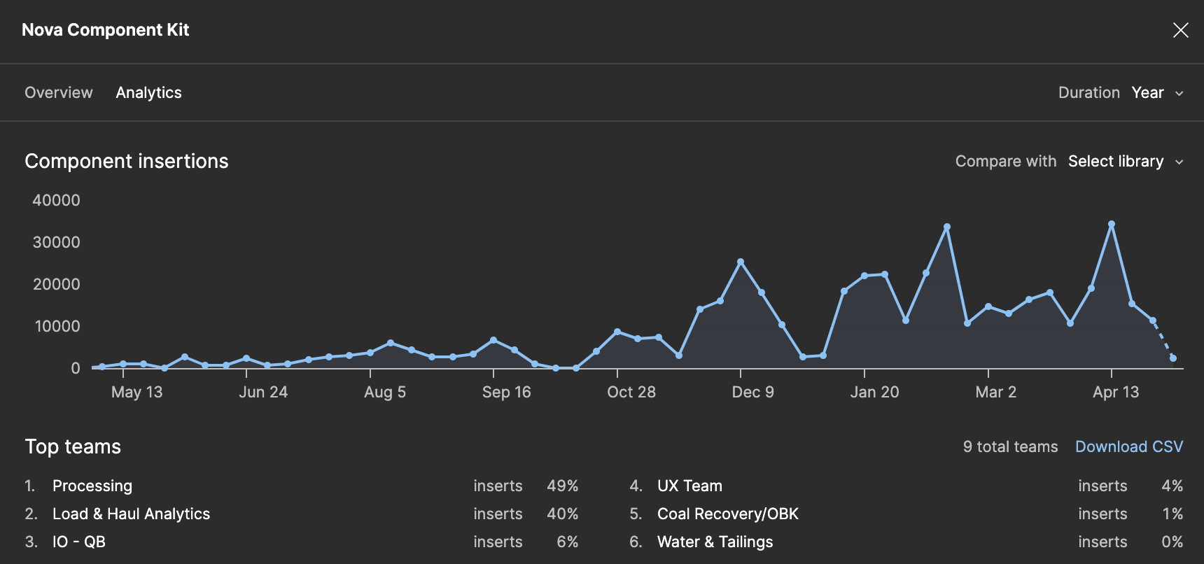
Component Kit usage over a year
My contributions
Our design system is based on Atomic Design theory and is primarily inspired by Google’s Material Design. It consists of two main parts: the Foundations file for typography, colors, etc., and the Components file.
My key contributions to the Foundations file include:
Introducing and setting up state layer colors
Impact: Established a systematic approach to state colors (hovered/focused/pressed).
Introducing and setting up color variables for Light/Dark modes
Impact: Saved significant time by eliminating the need to create separate dark mode designs.
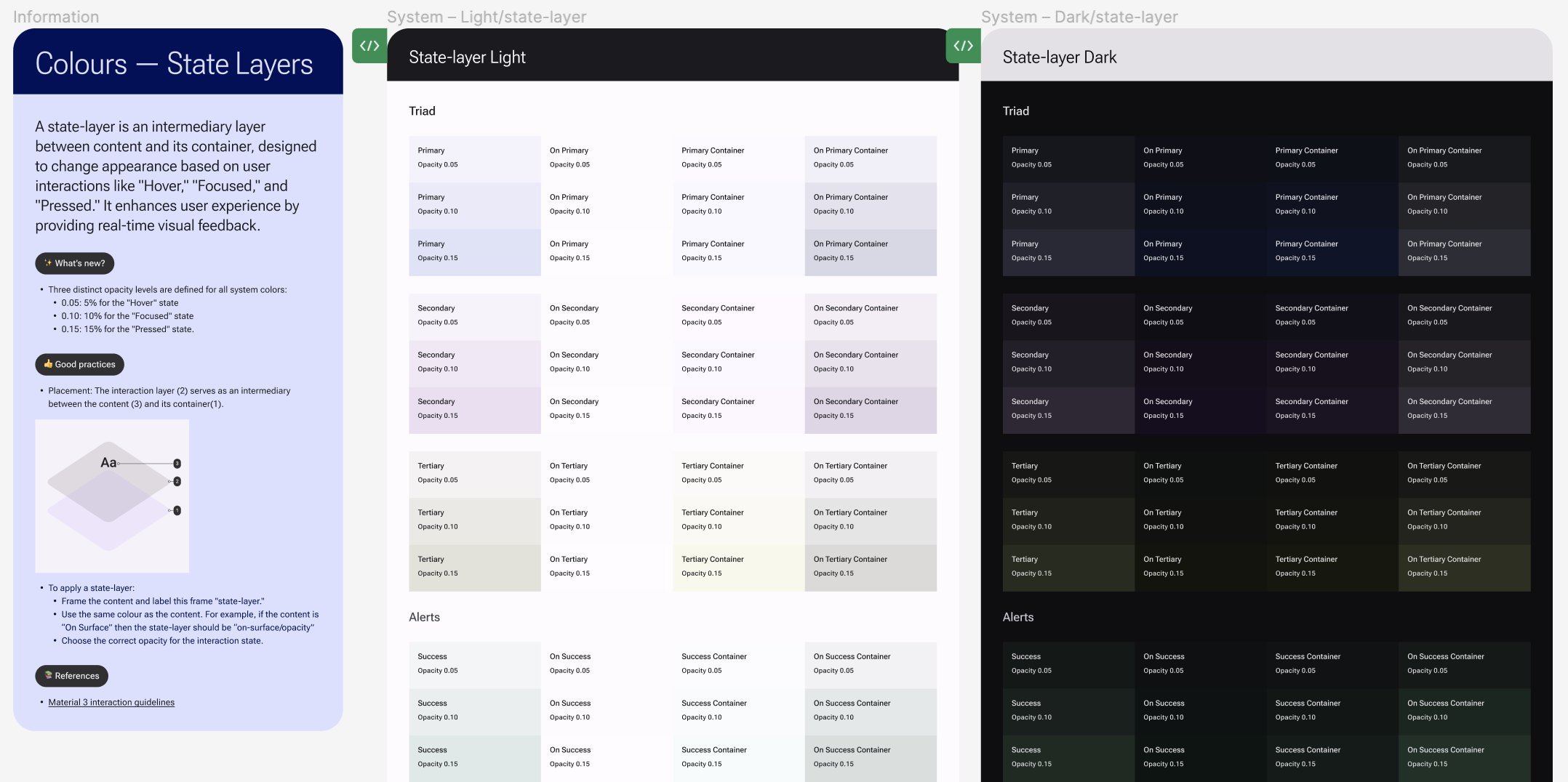
State layers
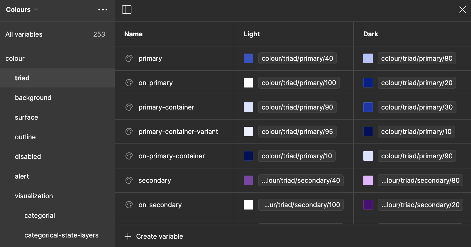
Colours variables
My key contributions to the Components file include:
Creating the Table component
Impact: Became the most used component by designers, with a detach rate of only 0.15%.
Creating the Chart component
Impact: Enabled the creation of responsive charts.
Creating responsive Page Templates
Impact: Provided a quick kickstart for design projects, unifying the look and feel of our products at the page level.
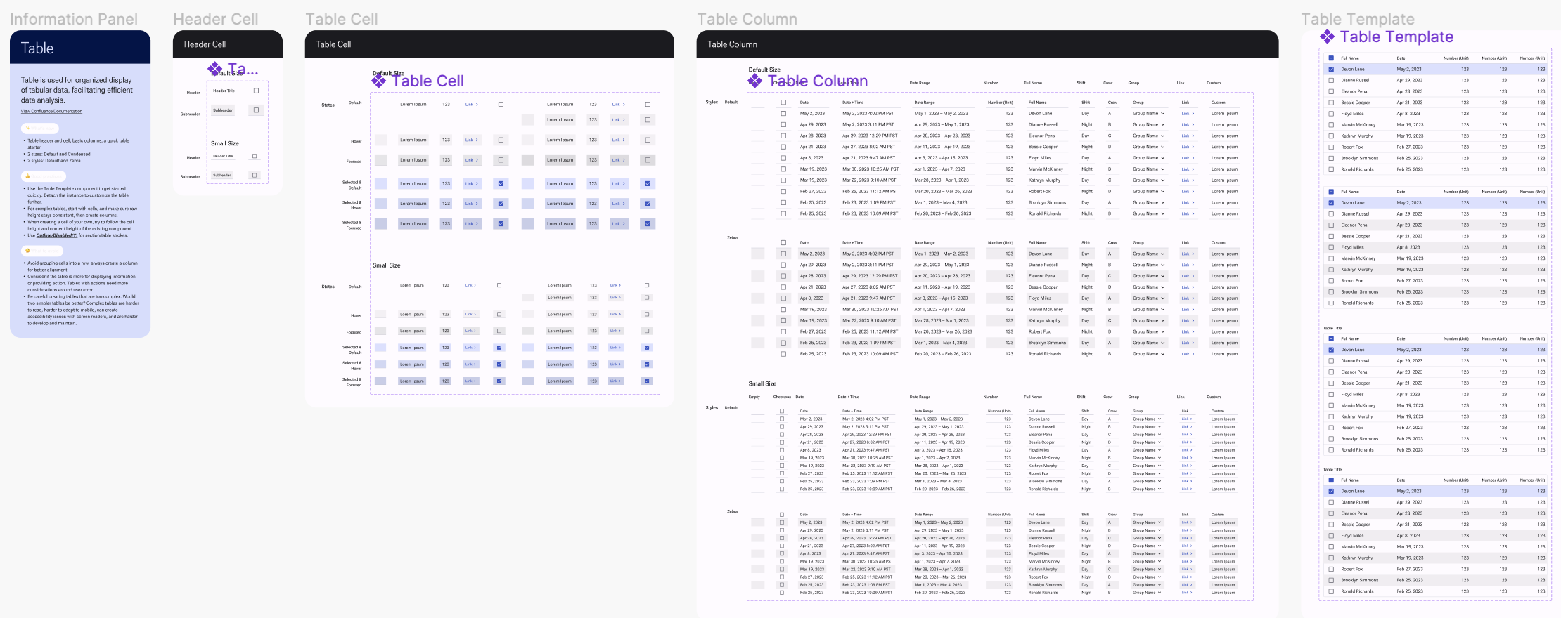
Table Component in Figma
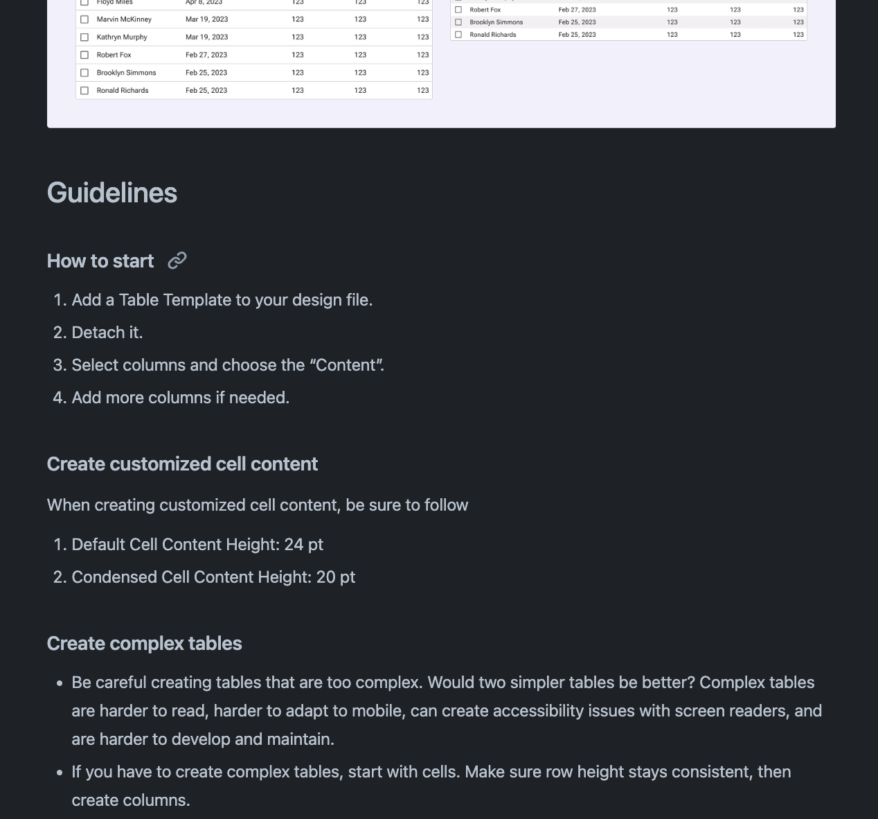
Table Documentation on Confluence
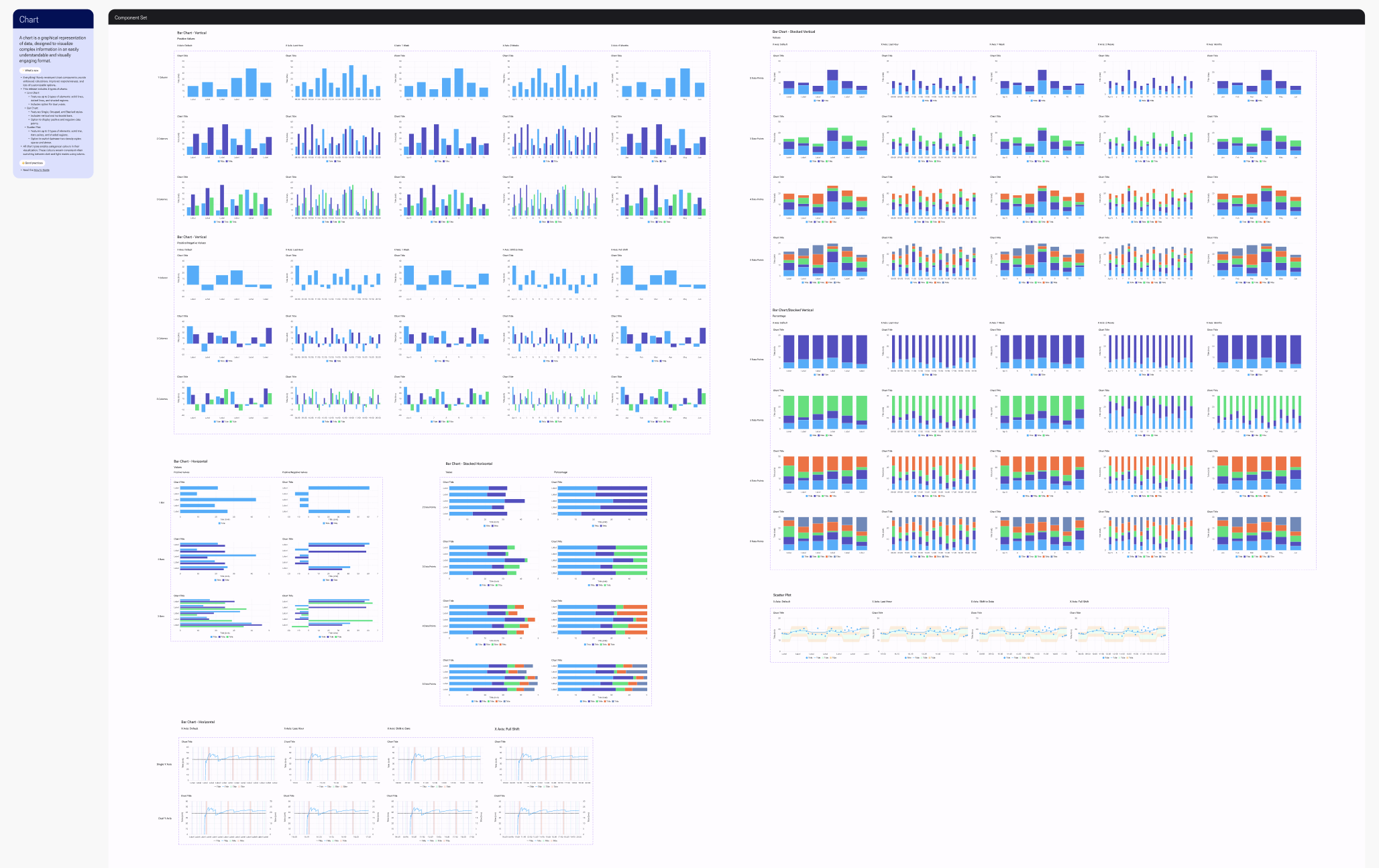
Chart Component
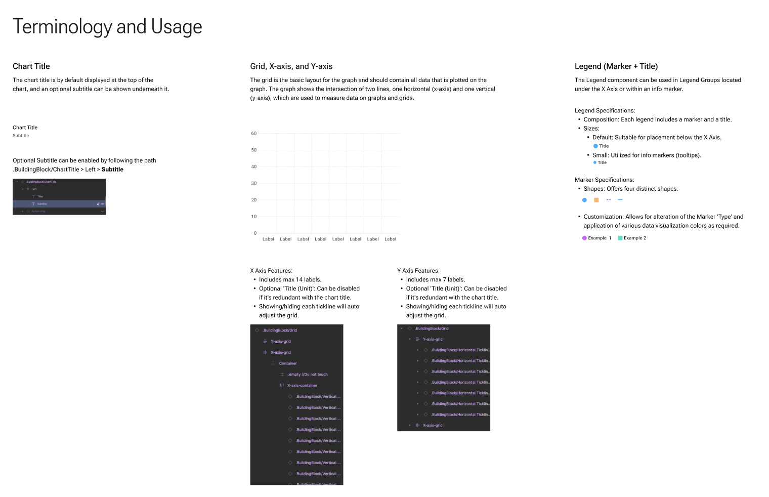
Chart Documentation
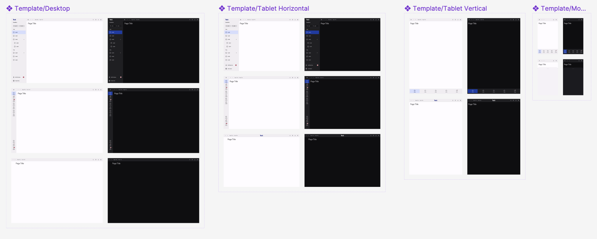
Responsive page templates
Our Processes
The process varies based on component complexity, but generally follows these steps:
Research
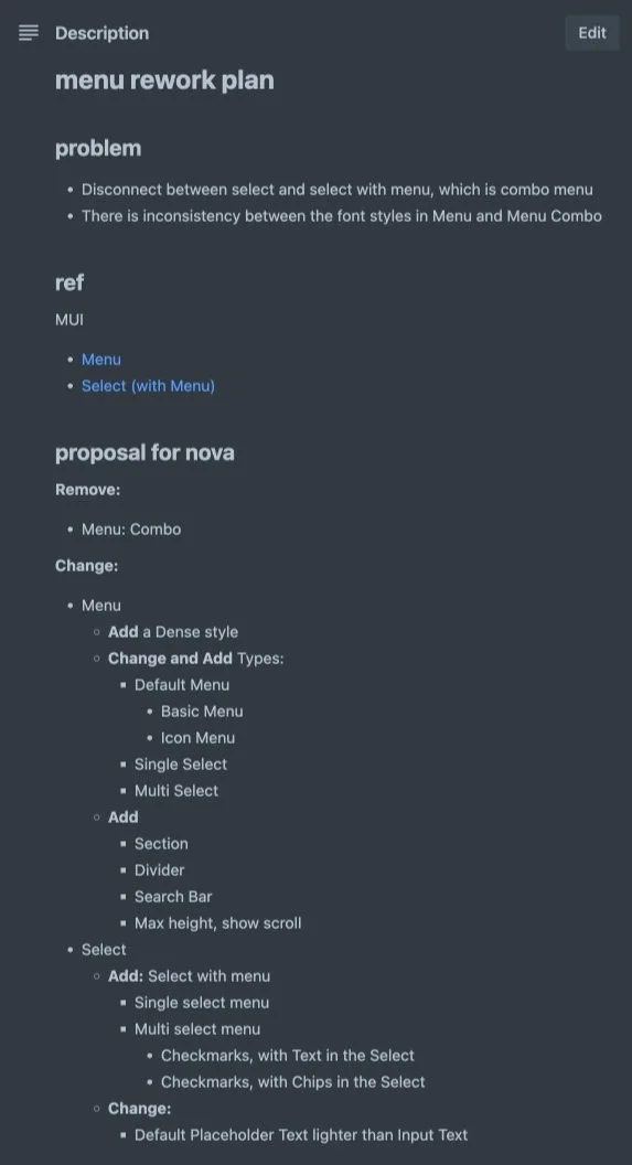
Reference design systems
Reference MUI
Collect needs from different design teams
Prioritization
Design System team prioritizes features
Planning
Designer drafts a plan for the component and shares it with the Design System team
Development
Designer creates a branch for the new component
Review
Design System team reviews the component, providing feedback and revisions
Finalization
Merge request: final review and revision
Merging and publishing
Communication & management
Weekly Design Standard meeting: Announce and walk through the new component
Teams: Set up a Design System Feedback channel
Trello: Intake and prioritize feedback, tasks planning
Confluence: Component documentation
Reference Design Systems
Material Design
Carbon Design System
Human Interface Guidelines | Apple Developer Documentation
Goldman Sachs Design
Lightning Design System
Atlassian Design System
Shopify Polaris
Continuous updates to keep pace with evolving requirements