Stanford Money, Made Easy
I worked as the primary UX Designer to redesign Stanford’s finance portal. The project’s primary goal was to improve information findability through thoughtful UX and modern UI.
WATCH VIDEO:
Stanford University - Fingate Final Design Showcase & User Feedback
What I Did
My responsibilities: personas & scenarios, ideation, wireframes, usability testing, collaborating with the clients.
UX RESEARCH
Analyzed user research data & created personas & key scenarios
WIREFRAME CONCEPTS
Translated user goals into concepts and created versions of key page wireframes. Then conducted usability research to produce designs that met most user needs.
In A Nutshell
PROJECT GOAL:
To help users find info quickly and see the big picture of finance at Stanford.
PLATFORM:
Responsive Web: Launch Site↗
WORK DONE:
Usability Testing, Wireframing, UI Design
TIMEFRAME:
3 months
OVERVIEW:
I participated in usability testing sessions, consolidated research data and led the design process from ideation to prototyping. Every week, I hosted a design review meeting with the client.
Research
To start the project, we conducted stakeholder and user interviews, and domain research to gather insights.
WORKSHOPS @ STANFORD UNIVERSITY
A series of workshops were held onsite to understand the project goals, and different types of users.
USER JOURNEY
Defined the three main scenarios for info finding. Created user journey to document how users interacted with the site to identify opportunities.
DOMAIN RESEARCH
Analyzed other university financial info sites.
Gathered inspirations with Stanford users’ specific needs and behaviors in mind.
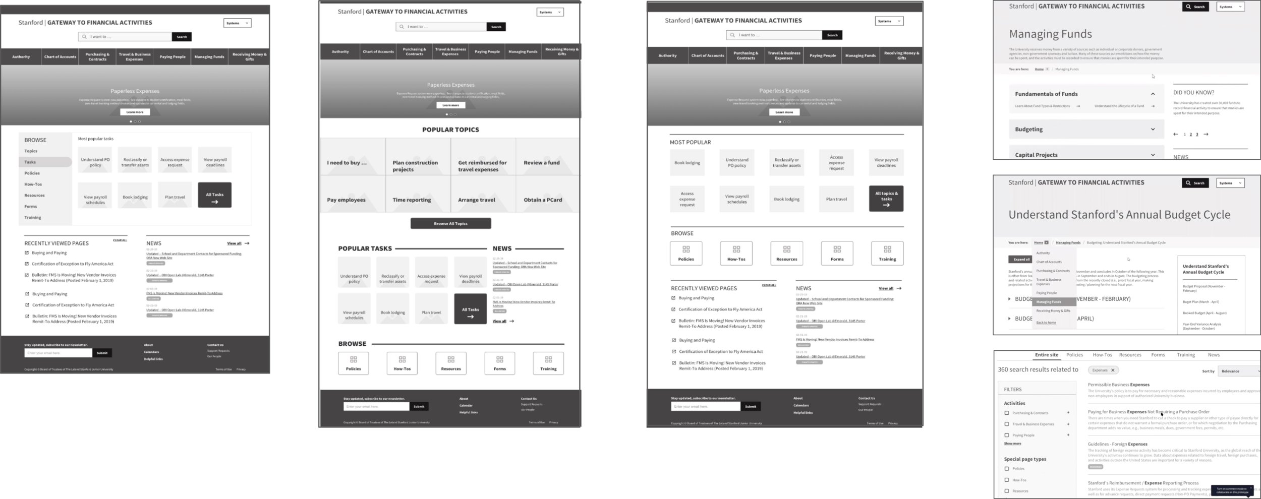
Wireframes
I consolidated project goals and user research findings and translated them into wireframes. Presented to the Design team, PM, BA, and the Lead Engineer before the client meeting every week.
Usability Testing
Throughout the project, I participated in several usability testings and gathered feedback to make sure that the design decisions were oriented around user needs.
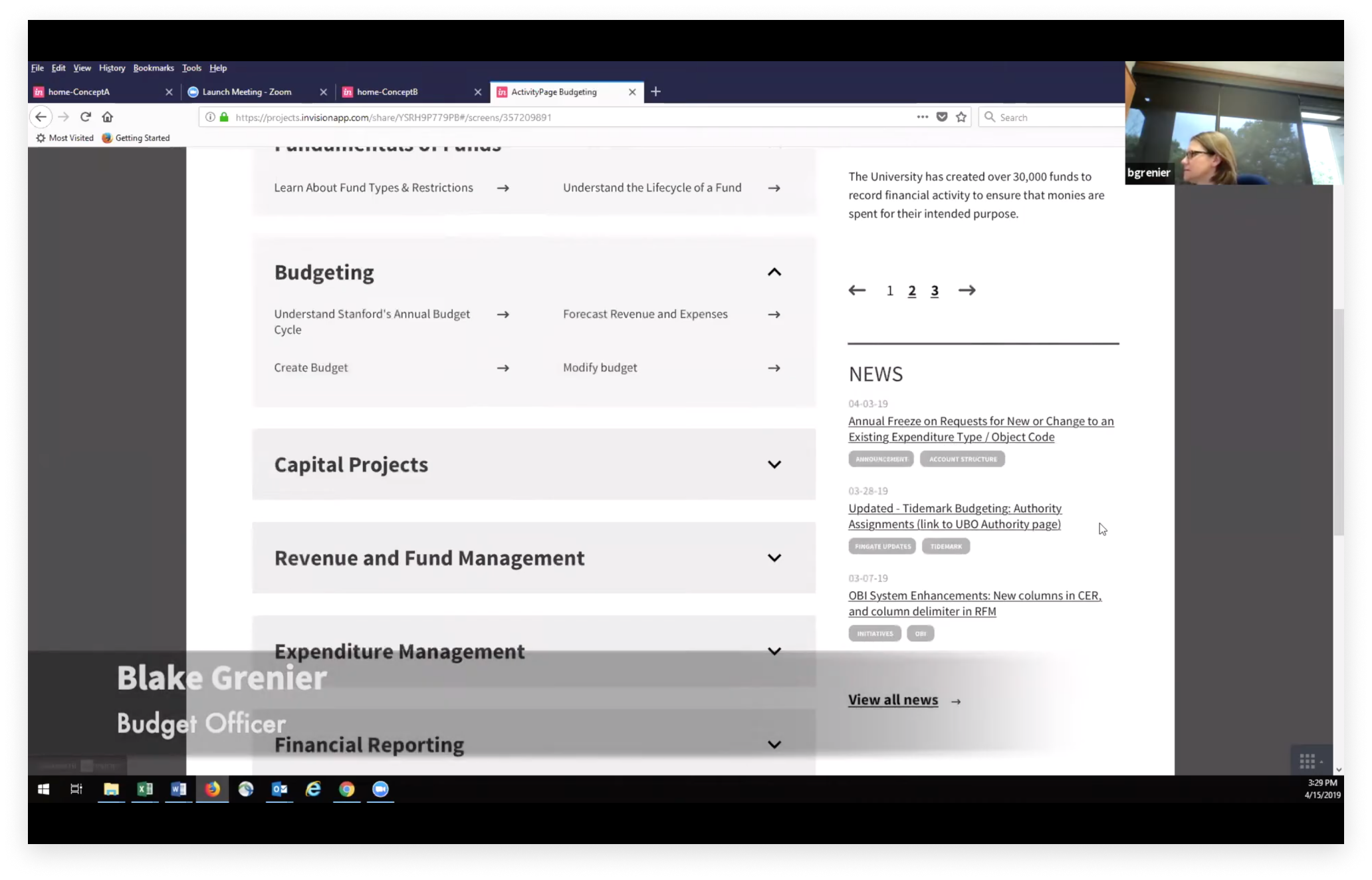
USER FEEDBACK: LO-FI PROTOTYPE
I created low-fi prototypes for navigation from the Homepage, menu to inner pages and the Search functionality.
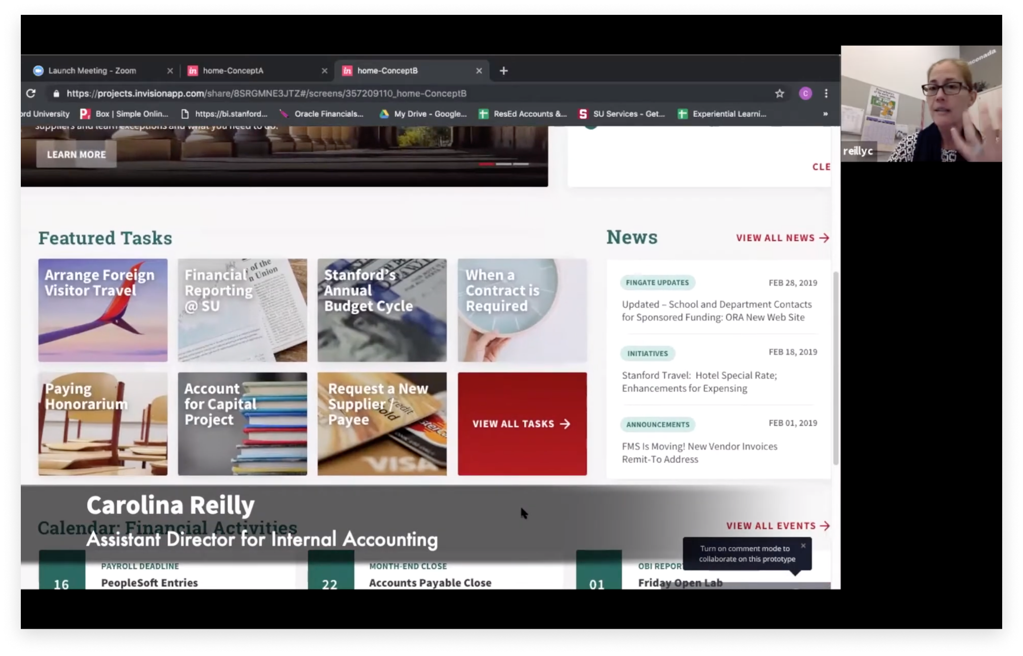
USER FEEDBACK: VISUAL DESIGN
I helped facilitate user interview sessions to gather feedback on the look and feel of the new design.
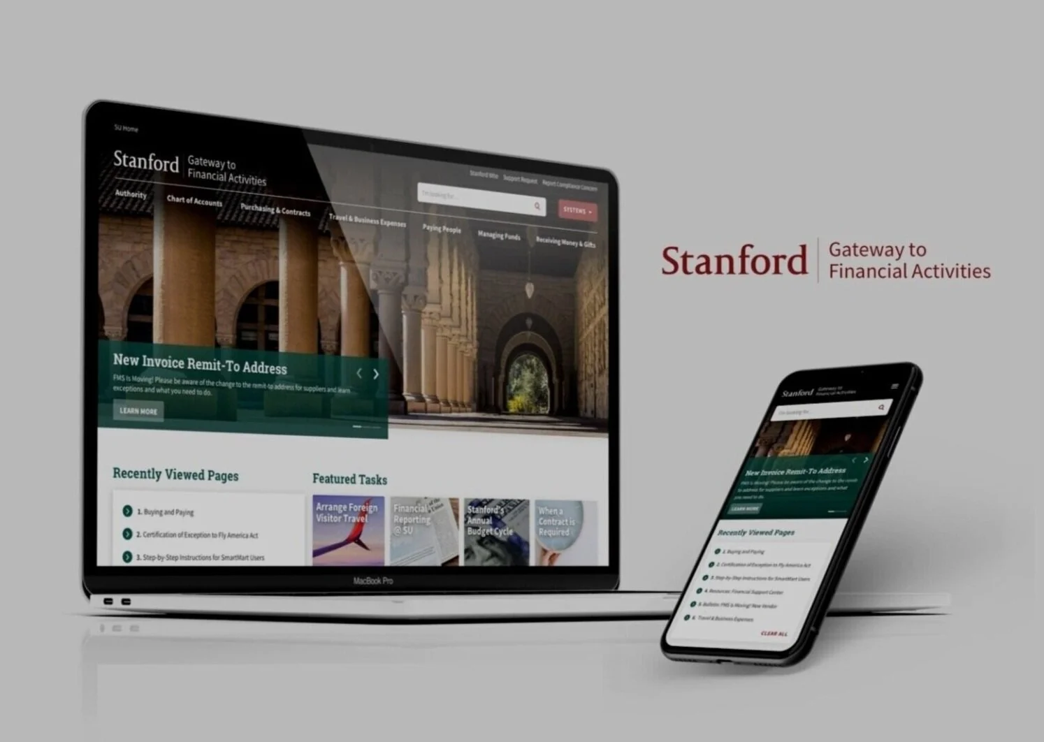
Final Design
The new Homepage made sure to provide high-level structure to help users find info quickly and see the big picture of finance at Stanford. Search page provided an alternative approach to info finding.
BEFORE
AFTER
With the client’s help on Information Architecture, I provided page structure for different levels of information that would help the user navigate and find their content.
Result
98% decrease in the use of search due to the improved IA.
30%+ increase in users and page views.
According to the client, “The new homepage features a clean, modern look with information organized into easy-to-understand activities and topics that help users see the big picture of finance at Stanford.”
According to the Stanford users, “the new site is ‘significantly better than the old site’ and ‘very organized,’ with ‘much easier’ navigation."