Retail Sales: Power BI Dashboard for Store Managers
Arc’teryx launched a set of global retail initiatives in 2024, and I joined the data team in July 2024 to enhance the user experience of their reports. The data team consists of five squads, including Retail, Supply Chain, and MF&A, with my focus being on Retail initiatives.
Intro
Project Goals
Arc’teryx operates ~40 stores across North America. The Retail Sales Dashboard aims to provide a comprehensive analysis of store performance relative to plan, replacing the Excel-based Traffic Report and the PDF-based ROS report with a dynamic, interactive Power BI solution.

Target Users
The dashboard is tailored primarily for Store Managers in North America, helping them focus on key performance metrics for their stores. Secondary users include Regional and Area Managers, who require broader insights into their regions.
Team & Responsibilities
Stakeholders: Store Managers, Regional Managers, Area Managers, and the Vice President of North America Stores & Global Retail Operations.
Project Team:
1 UX Designer (me)
1 Power BI Developer
2 Data Engineers
1 Product Analytics Manager
My Contributions
Conducted user research to understand store managers’ needs.
Designed wireframes to outline the report structure.
Developed visualizations and dashboards in Power BI.
Facilitated feedback sessions and iterated designs to ensure alignment with user expectations.
This project streamlines retail performance tracking, replacing static reports with interactive tools that empower store leaders to make data-driven decisions.

Research
I gathered some retail dashboard examples for ideas and reviewed related reports from Arc’teryx.
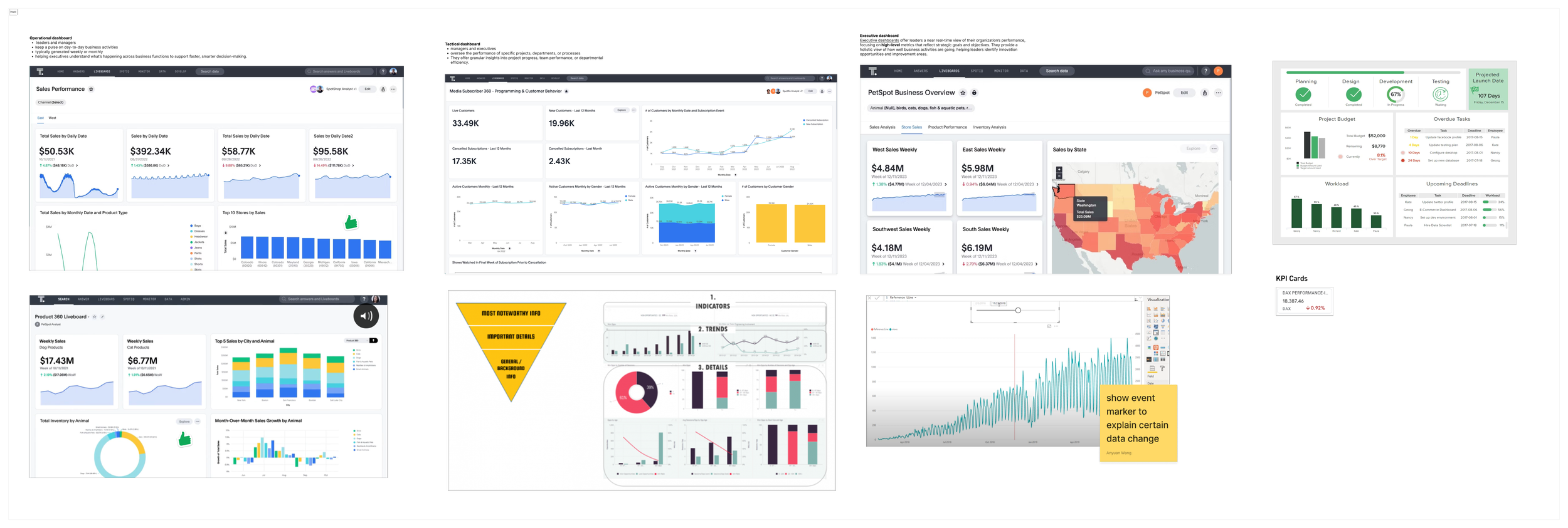
Inspirations
Existing reports
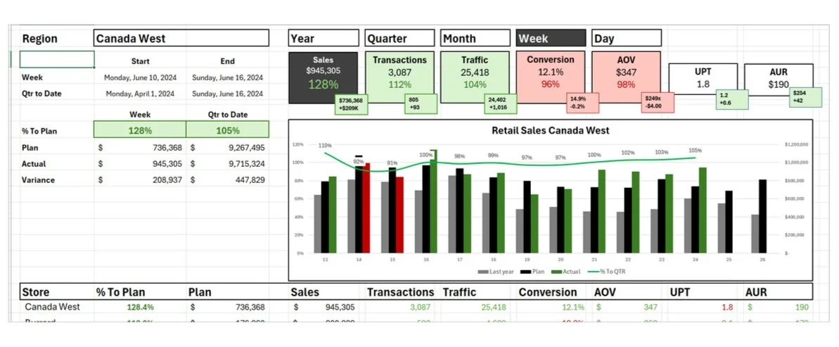
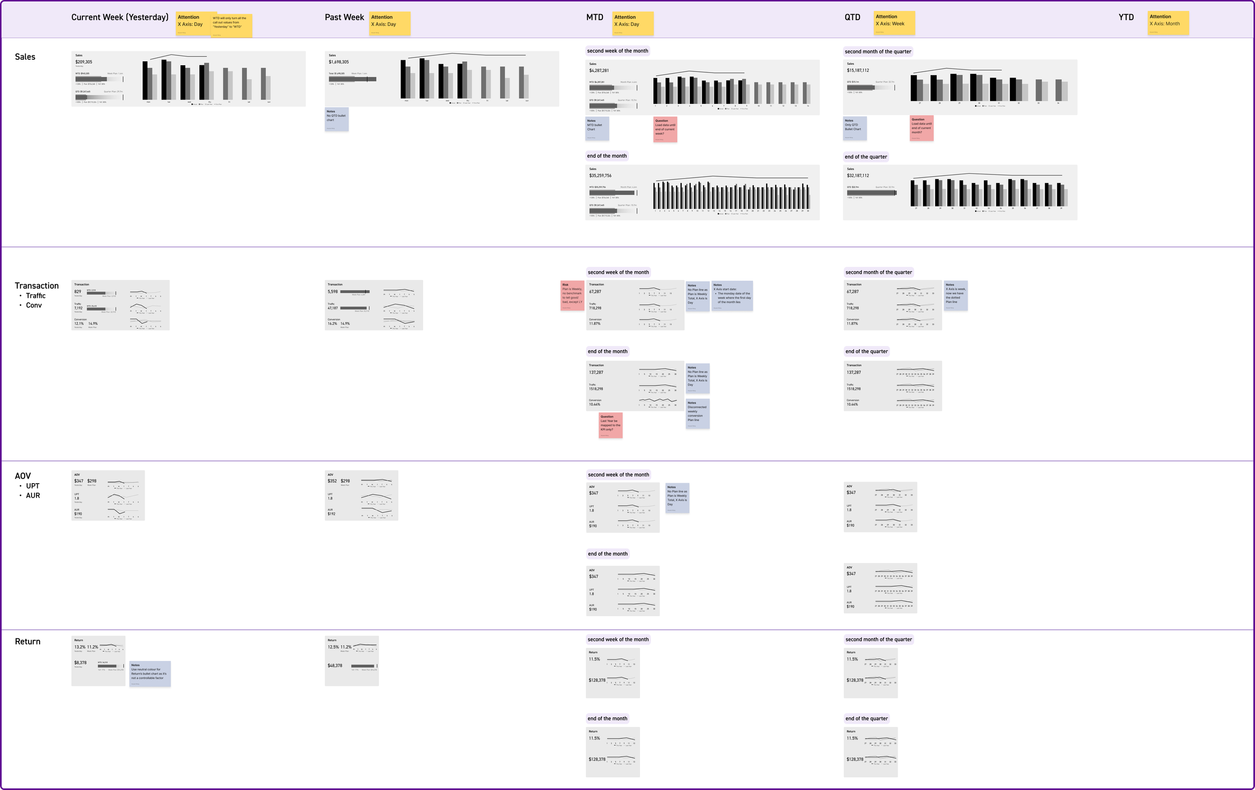
Wireframe
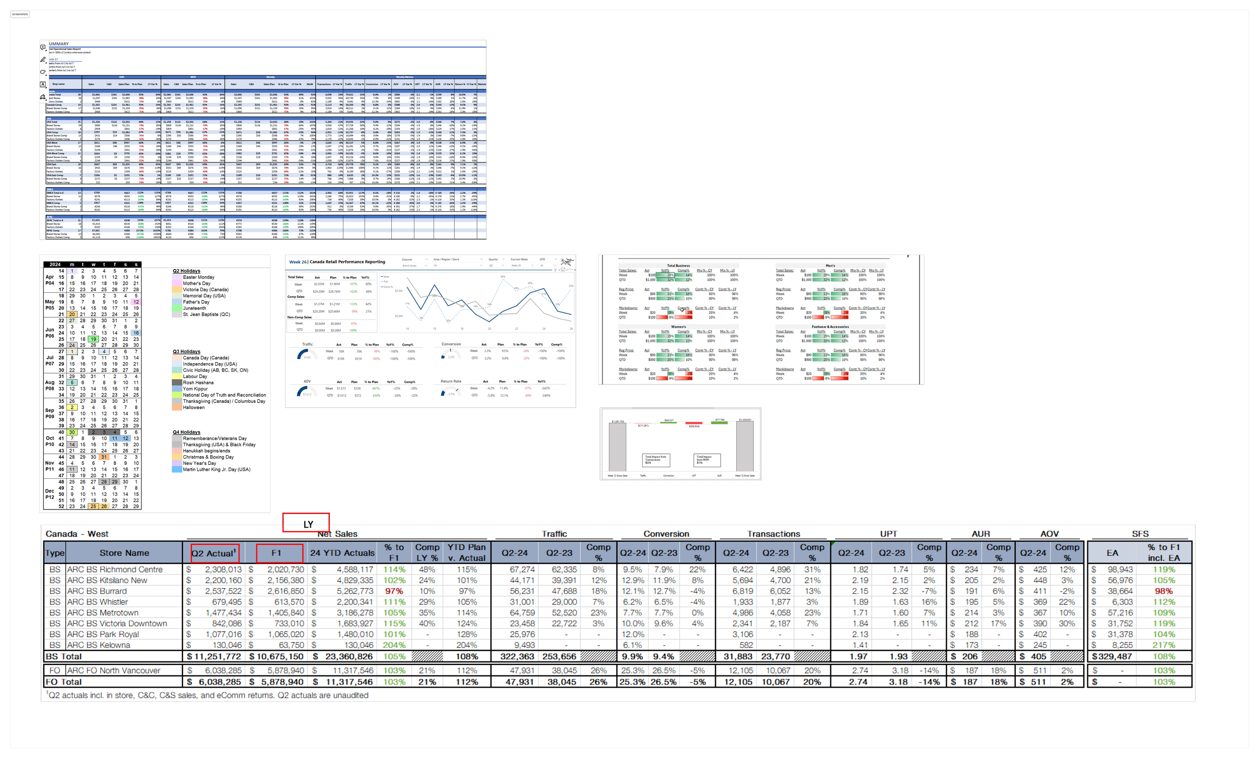
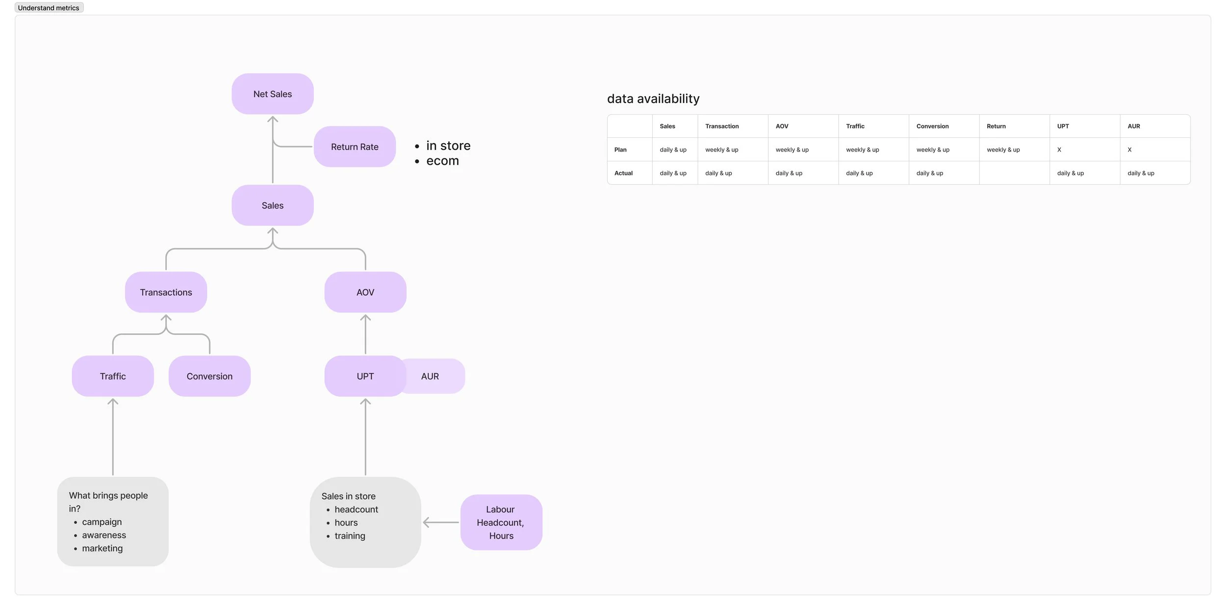
The wireframe went through several versions. A stakeholder made the Excel screenshot to show key information for the dashboard. I explored the connection between the metrics and created a diagram that helped shape the wireframe.
Here are two design proposals. The first improves the Excel Sketch, while the second highlights the key metric at the top.
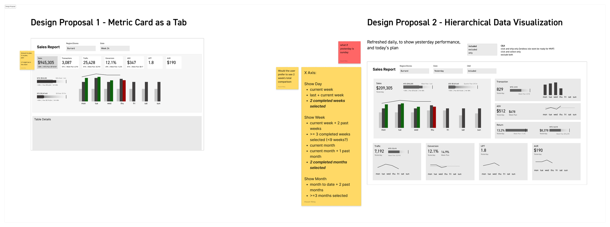
The team liked version 2. One suggestion was to teach Store Managers how the metrics are connected. I then made the third version, which was organized using a tree diagram.
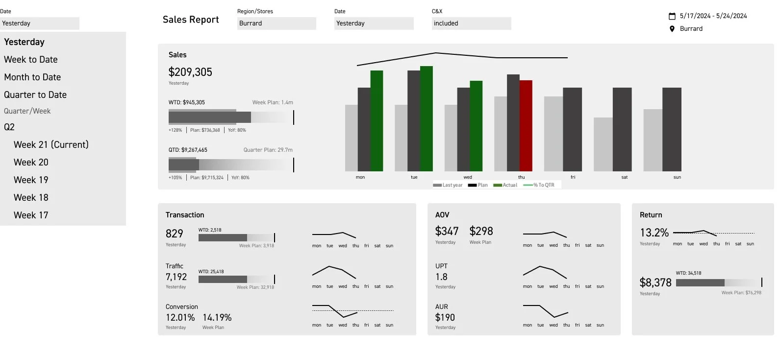
Below is the final approved version.
I made different versions of each chart depending on the chosen time frame: Week, Month, Quarter, or Year, because of data availability and usability issues.
Bring to PowerBI
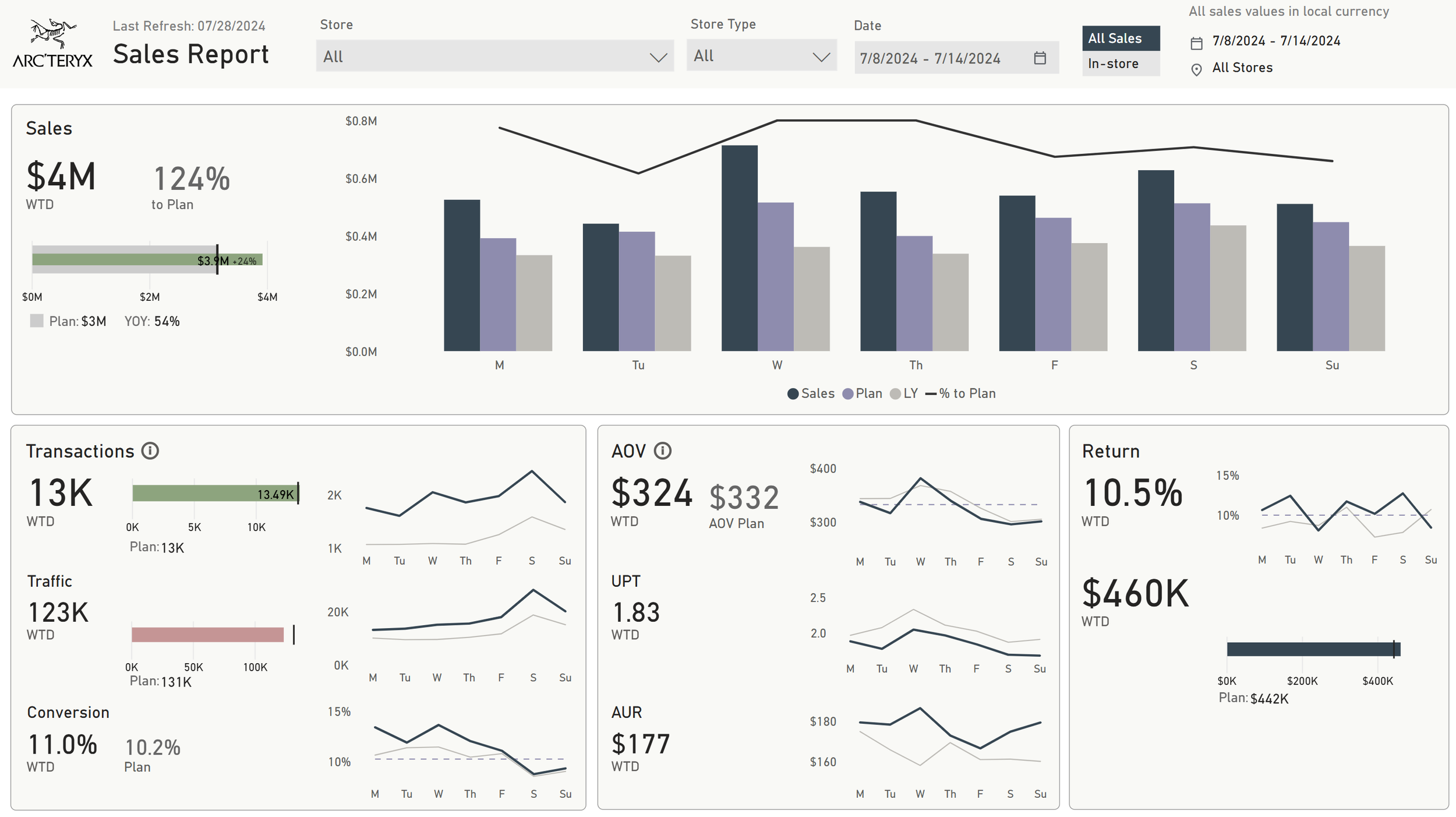
I worked closely with PowerBI developers, Data engineers on building the dashboard. A PowerBI developer first built the basic functionality then handed it over to me for visual improvement.

Initial PowerBI Developer Build
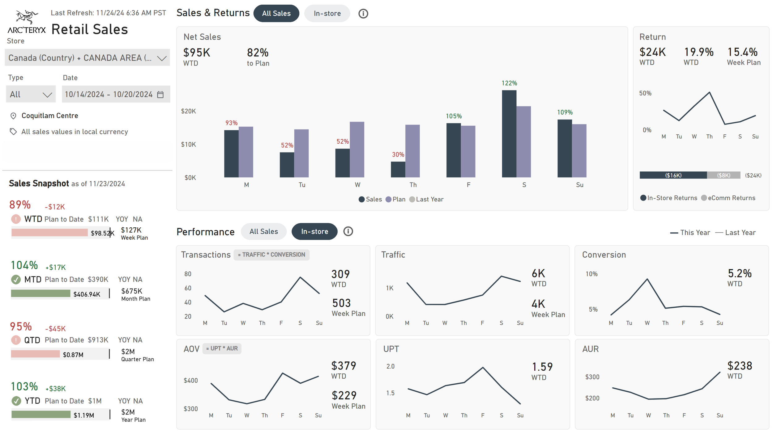
After visual development
User Feedback
In our monthly feedback sessions, users shared that they really liked the new dashboard. It combines all the data in one place, showing key metrics and past data, which saves them from searching through multiple reports.
However, they mentioned two areas for improvement: they want a quick overview of their goal progress and a clearer distinction between in-store sales and all sales (which includes online sales).
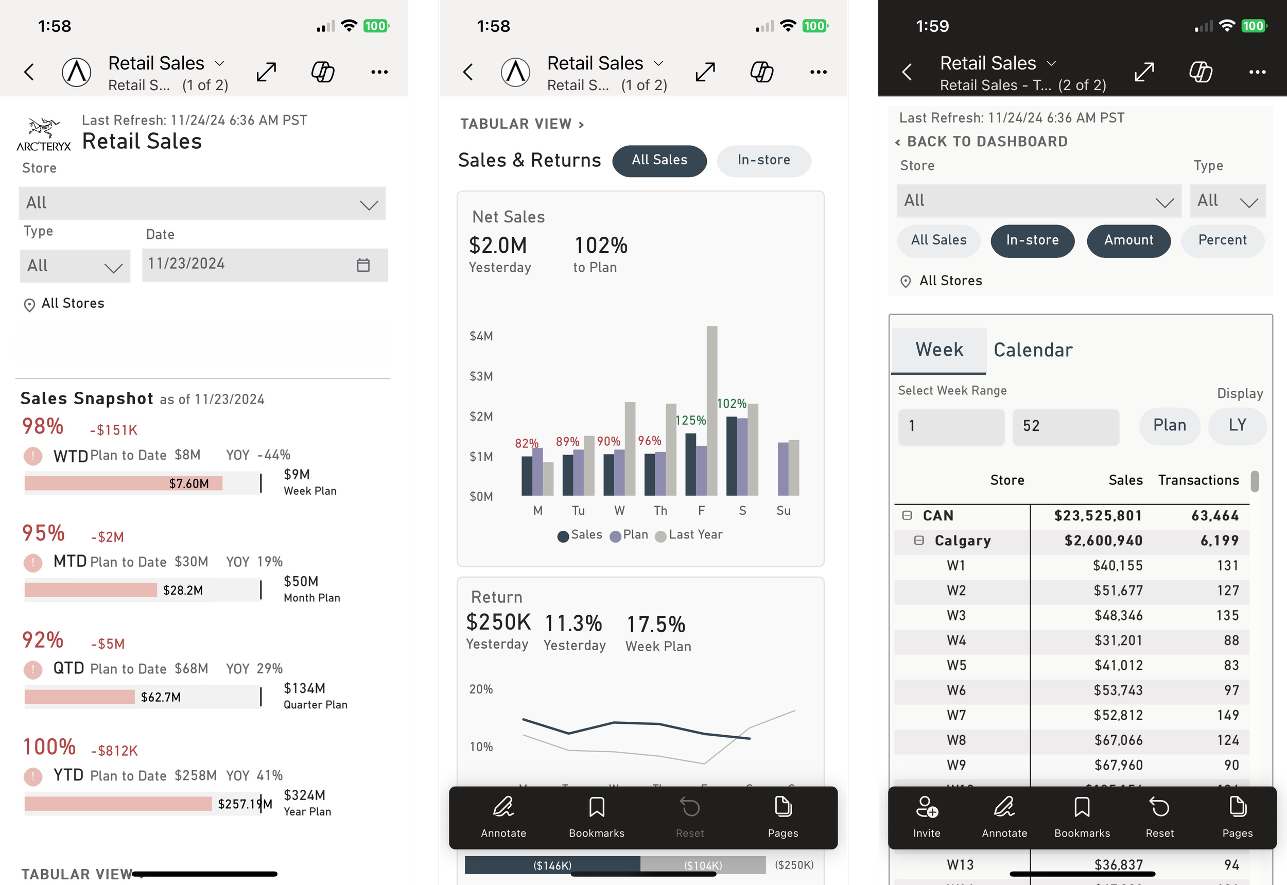
Final desktop & Mobile development
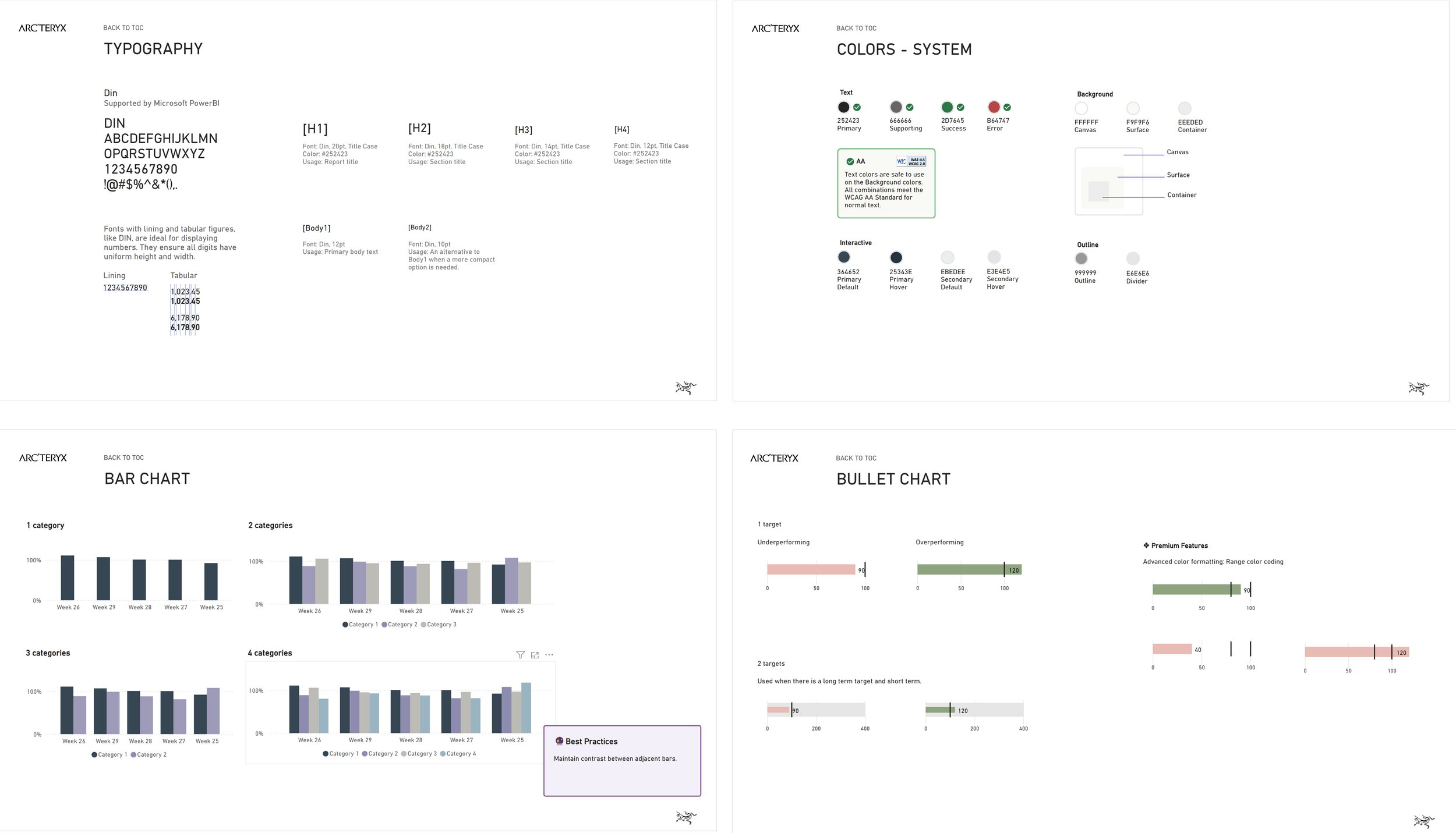
PowerBI Design System
Using my product design experience, I developed a PowerBI Design System to organize all components for consistent reporting.
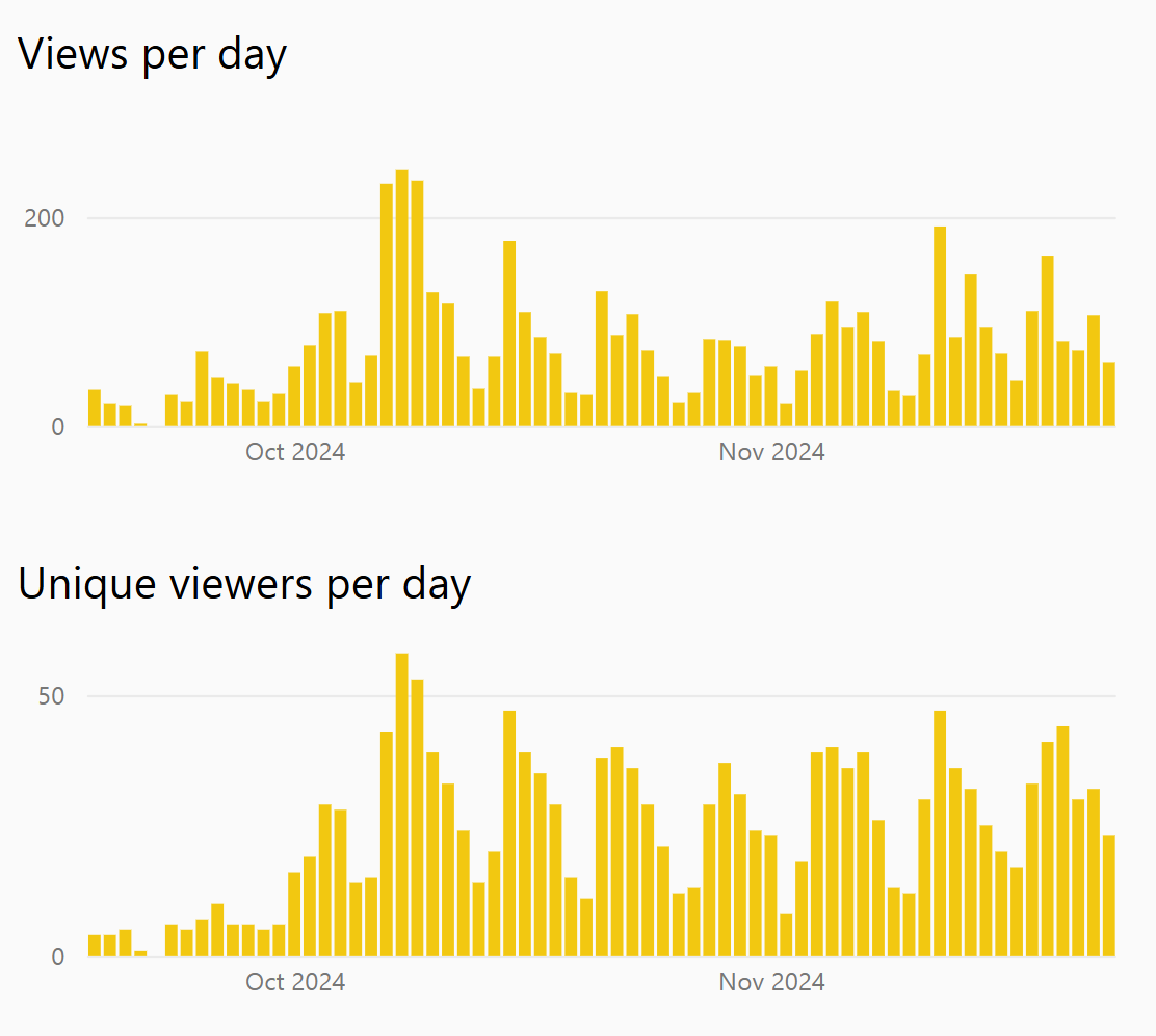
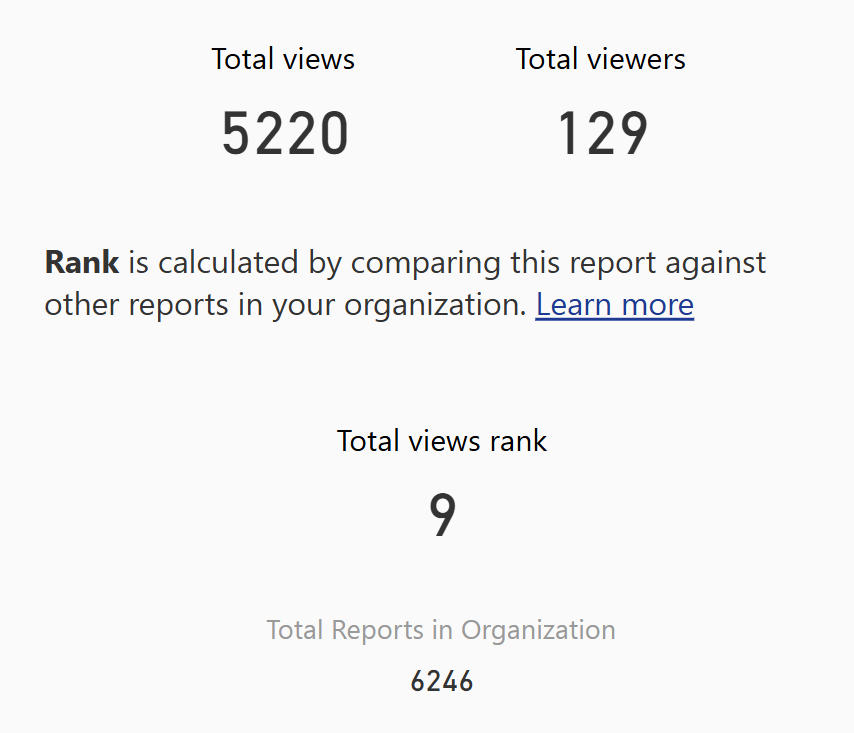
Impact
With around 40 targeted stores in North America, we gained over 5,000 views in under 60 days. Our report quickly became the 9th most viewed out of more than 6,000 in the organization.